Monday, November 23, 2015

Color and Blocks

The assignment: Composing clippings of magazines together over an existing photograph to create a new design. Here we had a lot of freedom to play with the inner designer inside. This was not to be a mosaic but rather a way of physically transforming a photograph to experiment with shapes and colors. Here I choose to only use triangles except for the bar that is over the woman's eyes. This piece is to represent that humans (skin tones) are around here but she can only see gold, therefore is gold rather than a human. It is to reflect the materialistic world we are living in today where we glamorize everything and forget to care as though there are not other humans who suffer. 


Friday, November 6, 2015

Photoshop

Who doesn't love photoshop? There are so many great ways to edit photos with color, contrast, form, and filters. This week we had to edit seven photos requiring different properties, with a theme. My theme was interaction with nature!

The first photo I had to play with high contrast. I did this by posterizing the image and applying a range of a color to the shapes made. The dark browns of the alpaca in the background contrast with the light colors of the foreground. When I went up to Holland, Michigan I ran into an alpaca farm with my friend. they were very gentle and liked to hum.

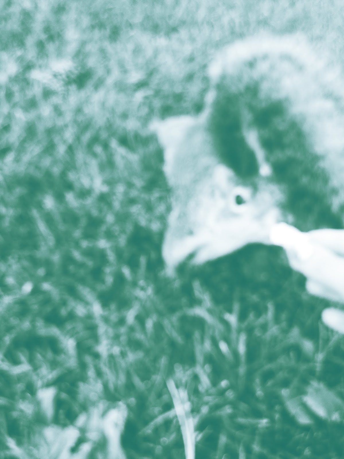
Next, effects of monochromatic. I went to duotone and chose white and a bluish green to help makes this squirrel even cuter. 

Next, effects of analogous colors. This was another shot taken at the alpaca farm. I appreciate the brightness of this yellow in contrast with the darker orange.

Next, Complimentary colors. In front of where I work, Natural History Museum, there is a butterfly garden that attracts all kinds of different bugs, including bumble bees. Here purple and yellow are used by the duotone mode.


Next, triad color system. This means I had to pick three colors that went well nicely with each other. It is a bit abstract but believe or not, this is a tree stump covered in moss. It is hard to see but hints of mint green are sprinkled to compliment the deep red and peach colors. 

Next, playing with color channels and filters. Here is a milkweed plant releasing it's seeds with cotton like fibers that will be carried away by the wind. I can't exactly remember how I did this but I played with the channels and desaturation.

And at last, playing with the crazy brush tools on Photoshop and filters. After using the maple leaf brush tool, I used a liquify filter for the warm colors and left the background raw.





Thursday, October 29, 2015

For the first assignment this week we had to compose letters in boxes and create a cohesive background to explore color combinations and composition. I chose a palette that was inspired by a golf course I visited in Monterey, California.

The next assignment could be a composition of shapes or text that also explores color. At first I was only exploring shapes and color combinations instead of creating a cascading effect which was also apart of the assignment. I didn't want to use external sites to find colors that worked well together but rather in nature. 

Here is my final one that fulfills the cascading effect.
I played with circles like bubbles flowing over the side of a hot beverage. Then I over laid red lines to create a more geometric feel to the design and make the piece more harmonious to the dark red background. 


Thursday, October 22, 2015

Hey! The assignment this week was to capture four photos that had specific qualities including: highly contrasting lights and darks, an extreme vantage point, transparencies (a reflective or transparent quality), and an anomaly. I choose to include all of the qualities in all four of my photos.

My theme was the eyes of the world though a tiny creatures eyes. I have always believed that in my writing or in self reflection I believe I am a small mouse in the grass or bug crawling on a window that observes details in daily life closely to find beauty and appreciate minute things. This is a great way to live because every day is filled with amazing senses of smell and color that can turn any tragic day into positivity. Anyways, enough with my lifestyle. Here are my four images. I took them through the microscope camera at my job at the natural history museum to get a macro view, extreme vantage point, of fruits and flowers.


I wanted these pieces to be abstract when at first you ask yourself and those around you, "what the heck could this be?". Texture was also important too because when you are small you notice if the ground a human walks on is not flat but rather is dented and has rivets. The rule of thirds also played a key part in com positioning my elements. I wanted to have some kind of order in the abstraction to attract the viewers to an vaguely, recognizable pattern. 


Thursday, October 1, 2015

Today's assignment involves letters as they are. The first one is to create a specific letter by combining two fonts together to create a new font.

The second part of the project was to compose your initials in an interesting way that you could use as a logo for yourself. It was to be professional but I am quirky so my first try had crazy colors


Here is the professional one. I like the first one much better.


And no this is not the Michigan "M".


Tuesday, September 29, 2015

Assignment 2

In our second assignment we had three different pieces to complete that all involved balancing positive and negative space. The first piece we were to use ten squares to create a unique composition in which it is difficult to distinguish if we used black boxes on a white surface or white boxes on a black surface.


Aligning the edges of the blocks helps!

The second piece we had to choose a different composition and add line and shape making it look more complex.

The final piece was dedicated to composing words as a shape rather than as a language. We were allowed to use color so this would be my favorite, however, I had the most trouble with this piece.


Thursday, September 17, 2015

First assignment for 2D design: LINE MOVEMENT

For this assignment I started from the very bottom. I didn't know anything about Adobe Illustrator except for its name. My first design took me an hour and a half because I didn't have a clue of what I was doing but then my instructor, Dennis, helped me and it clicked. The goal of this object was to use lines and implied lines to create a sense of fluid movement.

Here is my first go that took about 3 hours.


This design did not work out although the movement was there, staggered back and forth, it was too basic. The thick lines were boxes and didn't create enough fluid movement. So I got some assistants and....

This creates a movement expanding outwards like a drop in a puddle.